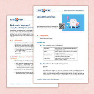
 In the last few years, I have worked for Lingo@work multiple times. I designed their logo and website. However, that same website was later on renewed by me, because their vision and target audience had changed over the years.
The last step was designing class material for the students. I started with the first chapter, I designed into a chapter that fit right into their branding. When designing a template for multiple use, you have to take into consideration that the content may be longer or shorter per chapter. I looked at the use of color, the use of fonts and the illustrations. For this, I always like to use Styles in Indesign.
When using Styles, you indicate per style how it should look like. For example:
- the Style Plain Text, 11 point, 13 spacing, color black
- The Style Head: 35 point, 40 spacing, color red
Working this way, by using styles, you reduce the errors between templates.
Now the design of the template was set, I created the follow-up templates in the same way. After making a design, the rest of the work was nothing but pre-press design; making sure every chapter look the same (and in case of a print file, make it print ready). The templates were merged to be used in Lingo@Work’s online teaching system.
Are you in need of a graphic designer or pre press designer for your class material or any other print related projects. Book a free consult to discuss your project!
